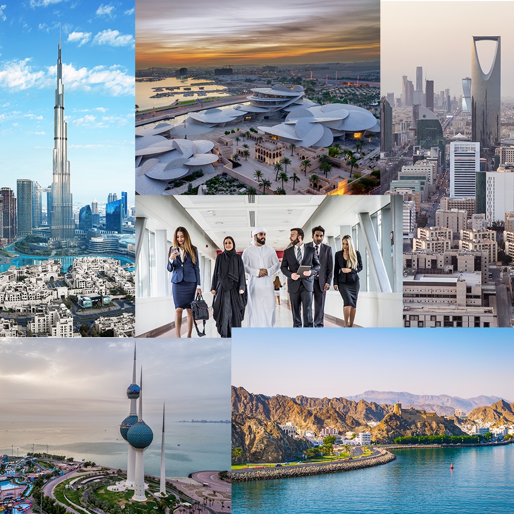
Background
At the end of 2014, the Dutch Embassy in the UAE started the development of a long term, integrated public diplomacy strategy. The goal of this strategy was to develop a positive and realistic image of the Netherlands and Dutch businesses within the Middle East region. This supports the overall objective of the embassy to promote Dutch businesses and create an enabling environment for trade between the Netherlands and UAE. At the same time, public diplomacy helps the embassy to become more client-orientated and customer-friendly.
The brief
The Dutch Embassy of the UAE engaged UP to create a logotype that would reflect the new integrated public diplomacy strategy. The logo needed to include a tagline in both English and Arabic, and needed to follow the brand identity guidelines.
The two target audiences were:
- Dutch organizations: businesses and knowledge institutes
- UAE businesses and authorities
The work
To focus on integration of trade between cultures, UP decided to bring the message to a more personal level, so that the link between Holland and the Gulf territory, or region, is made on a less contentious footing.
By personalizing it using the term ‘Holland + You’, we also play into the Dutch ways of working, cooperating, and conducting business. When we then link this to the proposition of the Sustainable Urban Delta - “It’s not what we do for you, but what we do with you that counts,” then our message resonates at a fundamental level with the target group and is authentic to the Dutch character and way of working. It is inclusive and sets the stage for fruitful collaboration.