Stockholm is one of the world’s most beautiful cities. But that alone is not enough to differentiate it. Stockholm needed a more comprehensive positioning that included both tourism and inward investment perspectives.
Location
Sweden
Sector
Place & Destination
Service
Branding & communications
Background
Stockholm is one of the world’s most beautiful cities. But that alone is not enough to differentiate it. Stockholm needed a more comprehensive positioning that included both tourism and inward investment perspectives.
The brief
Stockholm had always prospered. But the 2001/02 dot-com crash affected Sweden and Stockholm in particular and added to this Swedish telecoms giant Ericsson was having problems as well. This hit Stockholm hard. Globalisation also changed things for Stockholm, as the rise of the internet and budget travel thrust the city onto a competitive global stage. As a consultancy, we used our international perspective to understand the challenges that Stockholm would have to overcome to remain competitive in the future.
Stockholm was also facing stiff local competition. Cities such as Copenhagen, Oslo and Amsterdam had been investing heavily in their destinations and infrastructure. Stockholm’s budget for brand building was fairly limited, as is often the case for many destinations. Stockholm also suffered from an overly inward looking focus, but urgently needed to position itself to attract an international audience. This would mean putting the city onto the radar of people who may have limited knowledge of Stockholm, or even Sweden. To achieve that, we needed a strong proposition that everyone could relate to.
The solution
With the Stockholm proposition firmly in place, we looked for a simple way to communicate it.
Stockholm combines both the new and the old. It has one of the world’s most progressive societies and is also a key global hub of the high tech industry. At the same time, Stockholm also has a beautiful thirteenth century town, Gamla Stan. We aimed to represent both angles in our font choice. The sans serif and clean typography were balanced with a more classical serif font in the tag line.
Blue represents Stockholm’s famous water and sky. The cool grey is a modern color representing the Scandinavian positioning.
Having a viable claim to your space is critical in city branding, as today’s consumer will quickly realize when claims are false. The brand book, was written in Swedish, as most of the stakeholders and partners were Swedish based organisations. It was developed to support the Stockholm brand, maintaining strong positioning as the most important destination in Scandinavia.
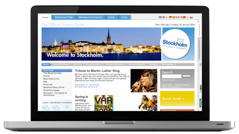
Our creative proposition: If Scandinavia was a country then Stockholm would be its capital. Stockholm, The Capital of Scandinavia. That line resonated as soon as it was written. It was bold, simple and more than a little provocative.


The results
Since the brand was unveiled in 2004, visibility, inward investment and tourism have increased significantly. In 2012, FDI Magazine named Stockholm the best region for foreign direct investment. In 2010 Stockholm was named the first European Green Capital. Inward investment is up and Stockholm is the leading choice for international companies locating to the Scandinavian region. Uptake from partners has also been impressive, with over 430 organisations around the Stockholm region using the brand. The strategy has also had a halo effect around the city, with over 50 municipalities forming an alliance to invest in the strong Stockholm brand.
Most importantly the positioning and branding work has been in place for more than 12 years now and survived three electoral cycles and been supported by politicians of different political parties. This consistency is critical for any place brand.


Let's connect

Find your local creative hub