Background
In September 2018 UP for Digital received an RFP from the British Veterinary Association (BVA) for a UX overhaul, and complete technical rebuild, of the BVA website. As the largest not-for-profit membership community for the veterinary profession in the UK, the BVA champion, support, and empower more than 18,000 vets of all ages, stages, and disciplines. The website is the go-to hub for veterinary journals, news, views and opportunities.
The brief
It was an exciting request to receive. This was partly because it presented a complex challenge, which is what gets us out of our pajamas in the morning, and partly because here was a potential client who were struggling with a technology platform that was reaching its end of life and they were being coerced to take up a replacement that did not feel right for the organization.
Winning the project was one of the highlights of our year, as we knew we could genuinely help the organization: we had the technical capability to help BVA achieve all of their complex 3rd party integrations while at the same time as incorporating slick e-commerce functionality, and integrating with their existing internal legacy CRM systems.
However, the main driver was to improve the user experience for the vets, as reports from customer research, and a deep dive into their analytics, revealed that the site was not serving their needs as best it could – especially accessing professional journals; we had to deliver a simple user experience for their membership community.
Concurrent with that, their Ektron content management system was reaching the end of its life. We needed to transform what had been reported as “a negative emotional experience” (AKA frustration and irritation) interacting with a creaking system.
The solution
Firstly, we ran a thorough audit on how vets were using the current BVA website and secondly, we ran a half day workshop with the Association’s senior management team to better understand the core outcomes they were after and what really mattered to them. Then we created a site map based on findings from the analytics and the workshop. This ushered in a consultation period where together we nailed down the vets’ requirements and ensured that they were being reflected in the site’s structure.
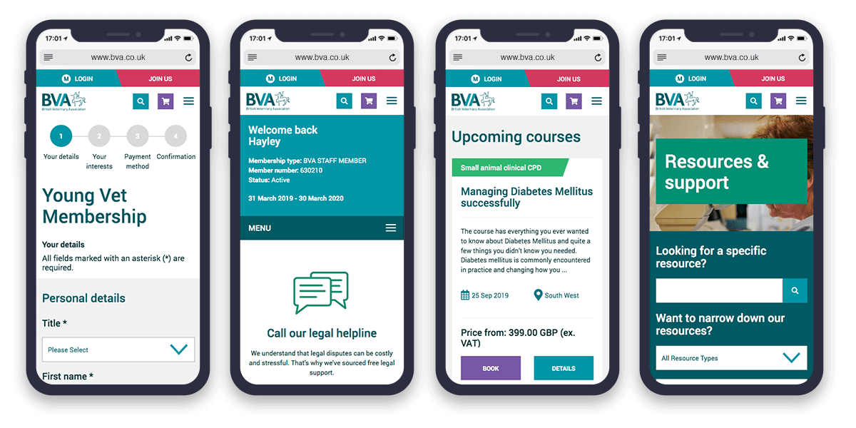
The next step was wire-framing and prototyping, where we really started to align information architecture with the user experience. All agencies do this of course. Where we differ (in our meagre opinion) is in our thoroughness. We work iteratively. We produced an initial set of wireframes, got feedback from the client, and then made improvements. In effect, we let the Association’s team put on their tweed caps and test drive the site – click on buttons, go down whatever back roads and country lanes they wanted to follow.
Our level of prototyping is extensive. The BVA got the full works. Over a period of six weeks we ran half a dozen two-hour workshops with different teams, examining the user journeys through each relevant section. No stone was left unturned, no cul-de-sac left unspotted – we prototyped every page.
Alongside usability is the look & feel: function and aesthetics. By the time we were working with BVA they had already commissioned a re-brand. We were more than happy to work in partnership with the branding design team. Using a style-tile we developed specific elements like header, footer, fonts, color palette, image treatment, and iconography: our one-page digital brand book defined how every individual element would work together and how they would work in isolation.
Once that was signed off, we were in a position to style up all the components necessary for each page and compile a full widget list.
Finally, we built all elements and integrated each component into the new Umbraco content management system. Writing this it does sound simple, but there were over 40-page components that all needed to be built and tested across every device from mobile to desktop.