Ascom is an international solution provider with comprehensive know how in mission-critical wireless communication. It has headquarters in Switzerland, Sweden and the US, with subsidiaries in 17 countries, and over 1600 employees worldwide. Ascom contacted UP to develop a new communications platform and visual identity.
Location
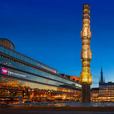
Sweden
Sector
Health
Service
Branding & communications / Digital marketing
Background
Ascom is an international solution provider with comprehensive know how in mission-critical wireless communication. It has headquarters in Switzerland, Sweden and the US, with subsidiaries in 17 countries, and over 1600 employees worldwide. The company operates in two areas: wireless solutions and network testing. Although it has operations in many industry sectors it has specialized expertise in integrated workflow solutions for healthcare.
The brief
Ascom contacted UP to develop a new communications platform and visual identity. They wanted a major change in their identity: from an IT provider to a healthcare provider. In order to retain their brand recognition they wanted to keep their existing logo, but requested UP to extend a new ‘look and feel’ to virtually all other aspects of their communications materials.
The solution
UP met up with the marketing team at Ascom in February 2015 for an initial briefing. It became apparent that we needed to carry out a comprehensive audit to truly understand the business and the company’s strategy. Interviews with key people, including the MD, Research Director and regional marketing managers, gave us deep insights into the challenges we had to overcome. This resulted in an approved agency brief - a solid platform from which we could start work.
Our creative team was set to the task of developing a new, more human look, and tone of voice. We presented three routes that were more focused on healthcare, but were all flexible enough to encompass other areas of their business such as security and retail. The client chose a route based on the line: “Closer to the people that really matter.” We rolled out this theme across their communications, including the website, CVI guideline portal on their intranet, internal and external communications materials, powerpoint templates, videos and advertising. The new look and feel was launched at MEDICA 2015, the world’s largest medical exhibition, where we created a totally new exhibition stand with signs, invitations, name badges and marketing for the exhibition. A smaller exhibition stand concept was subsequently developed to support the regional campaigns.


Let's connect
Find your local creative hub