When we think about brand design, one of the first things that comes to mind is the use of color. Sure, monochrome may look sleek, but color creates depth, emotion and energy. Without that pizazz of a snazzy color palette, the world would be dull and uniform.
Whether you’re looking at a rebrand, refresh or new brand identity for your business, you’ll come to the table with your own preconceived notions of how you want it to look. And that’s regardless of how creative you are.
A brief psychology of colors
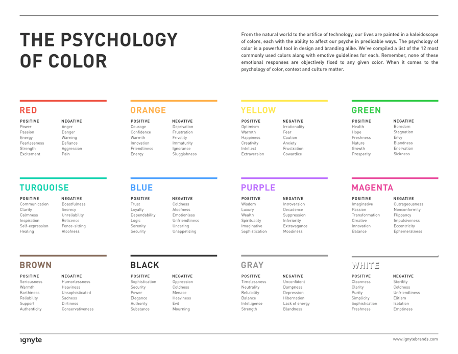
Years of research has gone into the relationship between color and psychology. However, the connotations of colors and how they influence decision makers is subjective. While some might associate yellow as cowardly, others see it as a marker of confidence.
Here, Ignyte looks at the pros and cons of the core colors. But it’s not until you start thinking about big name brands you associate with each that it comes alive.

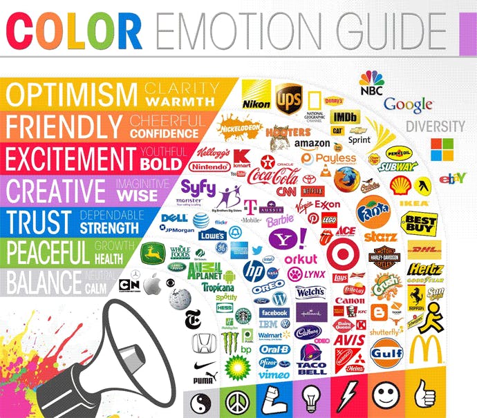
Let’s stick with our earlier example of yellow. For example, it is often considered a ‘budget’ color that doesn’t radiate quality. Yet look below and you'll spot Ferrari, who are an infamous super-car brand, with a mostly yellow logo.

Credit: The Logo Company
Brand personality: what are you trying to reflect?
We already know branding is more than just how it looks, it is personality too. And while that is mostly communicated through written content, visuals do play a large part in it.
When you work with a brand designer, they will talk to you about what you want to communicate. This will help create your brand guide, which will encompass a whole identity.
Your brand guide should include the following:
- An overview of your brand’s past, present and future, its personality and values
- Your message or mission statement, plus examples of how to apply these
- Tone of voice with examples of language and keywords to use in campaigns
- Your logo and how to use it (e.g. on black, white, transparent backgrounds and spacing)
- Your color palette
- Fonts and variations
- Your buyer personas
- Visual styles (photography, graphics)
- Guidelines for social media presence (e.g. use of logo on images, any adaptations to tone of voice/language)
- Design guides for email
- Design guides for ads
HelpScout noted: In a study titled “Impact of color on marketing,” researchers found that up to 90% of snap judgments made about products can be based on color alone.
Spotlight: Rebranding Basel Area Business & Innovation
UP THERE, EVERYWHERE recently worked on a rebranding project for Basel Area Business & Innovation. They are a not-for-profit organization dedicated to helping businesses succeed in the region.
The focus was to boost awareness, attracting more more companies to come set up there. The UP team immersed themselves with the stakeholders, businesses in the area and the city itself to appreciate what was on the table. Next, UP Digital helped create a new website.
Through developing an understanding, it became clear that there was always “More to Discover”. A phrase that would become a large part of the key messaging. The brand guide explains why this careful choice of words communicates the area best:
“More” is a key device and one that can be applied to every aspect of the economic activity of the Basel Area. It states simply that you can expect more. It helps reveal the surprising variation that the Basel Area has to offer – in business, culture science, knowledge, arts and environment.
The word “Discover” embodies aspects including expectation/potential/excitement/opportunity. It urges outsiders to look deeper or to look again, and in doing so to see the full potential, that may previously have been masked by existing preconceptions of regional or national characteristics.
Basel’s color palette and visuals
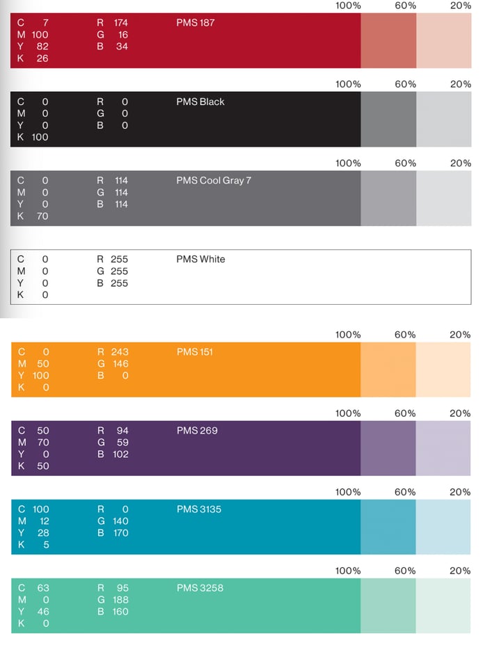
The primary colors are simple, with a nod to Basel's heritage. Everything about Basel Area is clean cut, precise and beautiful. The aim to reflect the area and its popularity particularly amongst scientific, innovation and research communities.
The secondary colors not only complement the primary palette, and also the style of photography. This focuses on sky, water, forest, urban areas and business environments.

There are strict visual guidelines: there are to be no night scenes. Imagery should be light, clean, spacious, with blue skies where possible. All symbolizing positivity, motivation and success.
How do I know if my branding resonates with my customers?
There are a number of ways to measure the impact of your branding. We review it from a holistic point of view, carrying out a total audit on all your touch points. This is not only because consistency is crucial for brand recognition and trust, but also because it isn’t limited to one single aspect.
If you are generating leads, converting customers and driving repeat sales, your branding is probably serving its purpose. But you may still want to freshen up.
If you are frequently getting requests for things you don't do, or website visitors who land with you using queries that don’t make sense, there’s a good chance something isn’t working.
Need help? No problem!
If you’re thinking about refreshing or rebranding your business but aren’t sure where to begin, here is your starting point. Contact Us and we will be in touch for a chat.

