Great website design can mean different things to different people. A car manufacturer might want a website that puts the product front and center. A photographer, one that showcases imagery well. An artist might look at a website from the standpoint of its aesthetic merits or originality. While, an Inbound Marketer from how well it's designed to convert traffic into leads.
For our purposes, a great website is one which is easy to navigate, speaks to its target audience with relevant and original content, is aesthetically pleasing, and makes use of a natural reading pattern (sometimes known as the F-pattern) that ensures the content can be understood quickly. In addition, a great website often dares to be different, while daring to be the same. (Meaning, it conforms to certain expected elements of page design and navigation but without looking like everyone else).
What follows, in no particular order, is a list of 12 notably good sites. With an estimated billion websites to choose from the list is by no means definitive.
1. Google
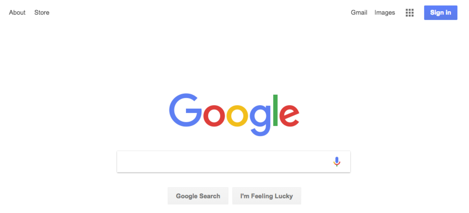
The tech giant bestrides the world like a colossus. It is even a verb. And while other search engines have gone the way of the dodo, Google goes from strength to strength.
Chief among its positive attributes is that it knows its customers better than they know themselves. One of its maxims is: “Focus on the user and all else will follow.” Nowhere is this more apparent than on its home page. For starters, it’s beautifully simple: just the logo and a search box. There would be little point in doing more. You look through a window, not at the glass – a truth evidently understood by Google’s designers.
Google’s in-house style guide decrees that all Google's product icons must be symmetrical and front facing. Consistency of look is a common feature of great websites. Small wonder Google remains the world’s number one search engine.
2. Montage
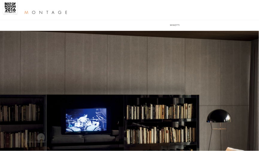
Founded in 1959 by Albert W. Sylvester and Howell A. Bates, Montage is the last word in furniture chic. From its subtle san serif logo with its orange ‘M’ to its tasteful photography, what strikes you about this site is its understated simplicity. There’s no need for bombast because they’re good and they know it. Every element on the site has one purpose in mind: to make the business of appreciating and ultimately buying their wares as simple and straightforward as possible.
The site never shouts, it whispers, and it does so with an attention to detail that speaks to the quality of company. The navigation is spot-on and the copy is crisp. The ‘About’ page, for example, does a brilliant job of blowing its own trumpet without appearing to do so. There’s no purple prose here – just a short history of the company from 1959 to the present. Click on ‘product group’ and you find yourself looking at a grid of easy-on-the-eye photos. It’s plain to see they know their audience well.
3. Feed
Here’s to the trailblazers like Feed and all those who push the envelope. A highly sophisticated property rights and payment platform, it has much to recommend it in visual terms, particularly its navigation. Not only does the content load horizontally as well as vertically, the animated scrolling is almost balletic in its elegance. But it is the video content that really draws the user in. It is beautiful, original and a little bit mesmerising. Check out Feed and be inspired.
4. South West – Heart of Travel campaign
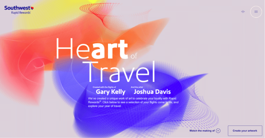
Southwest Airlines, I salute you! Designing your site using the shapes of your customers’ flight paths was inspired. Allowing your visitors to make art of a planned trip is genius. This website was created for a rewards program aimed at frequent flyers, but became the gatehouse for a brand determined to showcase originality. (Note: this website may be location-gated).
5. Bellroy
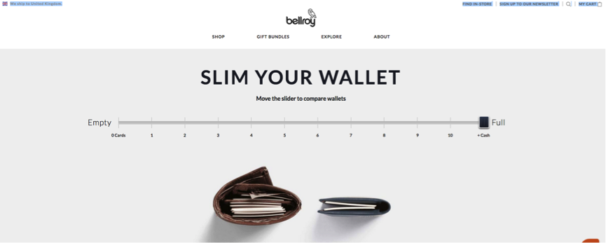
Thin wallets are Bellroy's USP and they communicate it with consummate skill. Particularly impressive is the interactive section showing how Bellroy’s product compares to its rivals.
The people at Bellroy also know a thing or two about the science of eye tracking. Eye tracking studies have shown that most of what people see lies in the top and left area of the screen. The F-shape pattern mimics how people read in the West and the Bellroy site hierarchy is designed with this in mind.
6. Woven Magazine
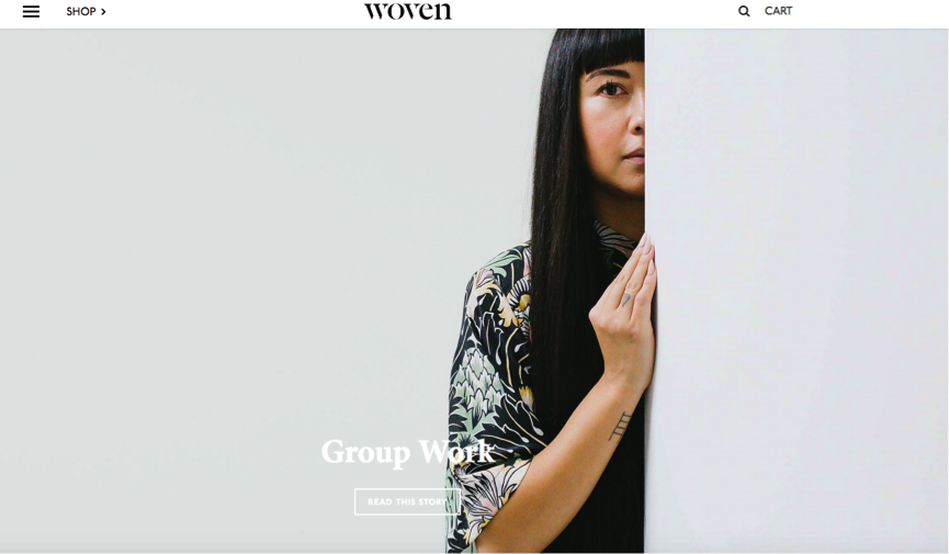
Big bold visuals coupled with immersive scrolling ensure that the articles for which this magazine has become rightly famous take centre stage. Great photography, plain backgrounds and a simple layout combine to make Woven Magazine a winner.
7. Another Pony
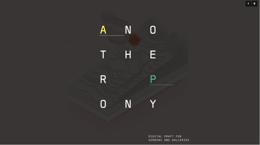
Convention is the ally of great sites, the enemy of bad. You have only a short window in which to pique the interest of your audience. Therefore, if your goal is to impress and stand out, you may have to take a risk. Artists and designers, especially, have to be willing to step off that cliff in order to make a splash. While playing with your users’ expectations has its place, adhering to certain conventions for the home page and navigation is also vitally important. Another Pony walks the line between aesthetic coolness and convention with aplomb.
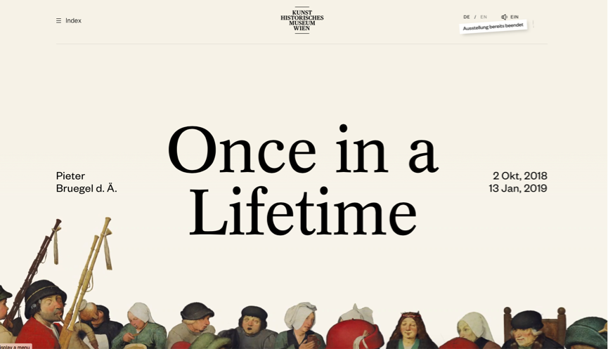
8. Bruegel - 'Once in a Lifetime'
Leave your mundane world behind for a moment and step into this interactive info site for the 'once in a lifetime exhibition' about Pieter Bruegel the Elder, initiated by the Art History Museum in Vienna.
What’s good about it? It has a unique and visually appealing way of presenting the content that is not only well optimized (no ridiculous requests to download Flash Player here), while being interactive and animated. This is appropriate and subtle animation at its best. You may have a hard time reading the content if you don’t speak German, but the visuals say a lot for themselves. What could be better than a website design so intuitive you don’t need to speak the language to navigate it?
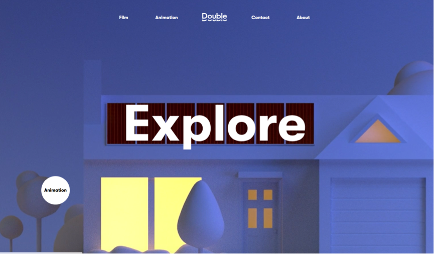
9. Double Double Belgium
With a stunning combination of video and color, this website jumps to life the second you arrive at the front door. The video and animation studio showcases their work in a lively, inventive way. It also makes good use of responsive design, if not lead generation or inbound methods.
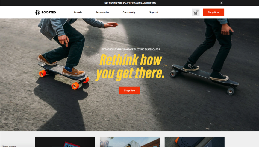
10. Boosted Boards
This e-commerce site incorporates some of the most important standards for today’s website design: strong custom photos, video, interactive content, lead generation tools, personalized content, testimonials and a traditional layout bumped up visually.
The company's blog has a strong sense of self—connecting with the issues their customers are most likely to care about without shying away from talking about problems the company is having with products. This level of transparency and head-on customer support is refreshing on a website.
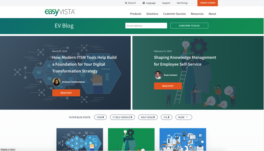
11. EasyVista
This five-language website makes great use of the Inbound methodology and lead generation principles while offering a visually appealing and graphically consistent approach. It presents a lot of content in a way that manages not to look cluttered. The card-style blog layout is modern and easy to navigate, and the consistent use of illustrations (rather than photos) helps it stand out from the crowd. (It also won a Hubspot Design award).
12. Tecan
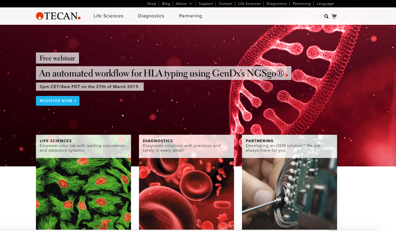
Paring things down is the order of the day for Tecan. The life science giant’s three core business areas are presented clearly at the top of the screen and a simple, magazine-style layout makes navigation within each of those categories a piece of cake. Powerful imagery grabs visitors’ attention and is carefully chosen to illustrate the content.
What have we learned?
- Simplicity rules. Don’t try to cram too much in.
- Consistency is king. Choose your style and stick to it.
- Imagery can make all the difference. Select photographs carefully and be aware of how they will be cropped and chopped to fit on different devices.
- Interactivity, in moderation, can really help your audience engagement.
- Beauty is highly prized. Gorgeous video and animated content might persuade people to spend more time on your website, boosting your search engine ranking.
- Don’t be too cool for school. Understand the F-pattern (natural reading pattern for scanning pages) and don’t be tempted to stray too far from the conventions of website navigation.
What is the F-pattern? It's a typical pattern of reader behavior uncovered in various usability studies. Researchers found that website visitors first read in a horizontal direction, usually across the upper part of the content area. Next, readers move down the page a bit and then read across in a horizontal movement again, but more briefly. Finally, readers scan the left side of the page in a vertical motion.
Understanding how usability issues, customer needs, and marketing goals such as SEO can impact website design will help you create a highly effective website.
Having website woes?
UP can fix that. Click the button to get in touch.

About the Author: Alex Beeching is an award-winning artist and illustrator, and member of UP There, Everywhere. This post includes input from Shari Monnes, UP Inbound Marketing Manager, and Mike McDowall, UP Content Editor.